Reflection Questions
1.)
I think the
good/strong parts of my logo designs are the color and words that go with it,
because it fits the logo well. I
2.)
I think I could
have done a better job with planning out my ideas, because some of my ideas
aren’t the best and it took me a while to decide what I wanted to do.
3.)
My theme was still
the anchor and chain with some words and color I added to it, I thought this
idea would work because it’s a little like the old design.
4.)
I think the overall
size, and color make a good logo, it also needs to create attention to its
viewers. I think this because these are good characteristics of a logo.
5.)
I could conclude
that doing a logo design is kind of hard, because it takes some time and thought
to come up with a good logo.
6.)
I learned that
going for a higher grade was a good idea. This is because I kept a timeline and
went for meets first and as I finished that I still had a bunch of time to go
for exceeding work.
Preliminary Designs
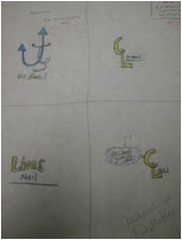
This is a picture of my designs that i drew before we started the project, i used two logos from these designs for my final project. for this design i use color pencil to draw and put detail into my overall design.

Overall Drawing
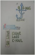
This is my picture of my final logos. i drew two because i did not make the first one big enough.
Close up 1
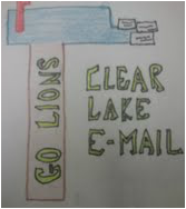
This is a close up of my first design. for this one i drew a mail box with mail coming out of it, to show that they have mail. i also aded the words Go Lions on the base of the mail box to show our school pride.
Close up 2
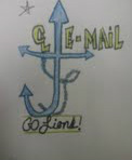
This is a close up of my first design. For this one i kept the same idea of the old logo, but aded a little CL to it and the word E-MAIL. this was my best design that i drew in my opinion.
