2-D: Monochromatic Emotion Painting February 24, 2012 Reflection.
1.) The good/strong parts of my painting are the different shades of the color i used, because the overall designs turned out pretty good.
2.) I could have taken my time better on this project, because the first painting i did, didnt turn out the way i wanted it to.
3.) well i did the theme confusion because im confused on what i want to do with my life when i get out of high school, i chose this emtion because it goes along with what im feeling right now.
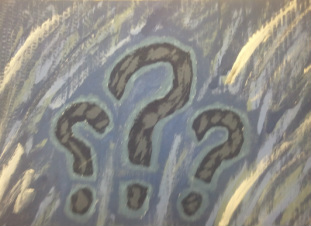
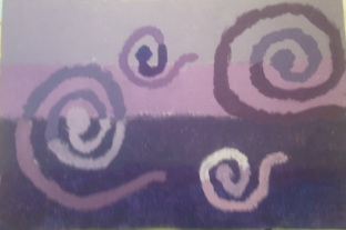
4.) The main hue in my first painting was blue, i chose this because i thought it represented confusion good. The main color in my second painting was violet, i chose this because it represents being relaxed.
5.) The light values i have on my painting is the different tints of blue over the background, and the dark values i had on my painting came around the question marks. i did this because i thought it would look good at the time.
6.) I learned by doing this project things arent always going to turn out as planned, because my design did not turn out the way i wanted it to. this can be applied in life in general because everything isnt going to go smoothly there are going to be bumbs in the road.
7.) The design of my painting was question marks, i did this because i was confused at the time. it wasnt really planned, and no it turnded out nothing like i would hoped it would.
8.) I think this is a very good project to, because it shows what kids are feeling. so you should continue to do this project in the future.
2.) I could have taken my time better on this project, because the first painting i did, didnt turn out the way i wanted it to.
3.) well i did the theme confusion because im confused on what i want to do with my life when i get out of high school, i chose this emtion because it goes along with what im feeling right now.
4.) The main hue in my first painting was blue, i chose this because i thought it represented confusion good. The main color in my second painting was violet, i chose this because it represents being relaxed.
5.) The light values i have on my painting is the different tints of blue over the background, and the dark values i had on my painting came around the question marks. i did this because i thought it would look good at the time.
6.) I learned by doing this project things arent always going to turn out as planned, because my design did not turn out the way i wanted it to. this can be applied in life in general because everything isnt going to go smoothly there are going to be bumbs in the road.
7.) The design of my painting was question marks, i did this because i was confused at the time. it wasnt really planned, and no it turnded out nothing like i would hoped it would.
8.) I think this is a very good project to, because it shows what kids are feeling. so you should continue to do this project in the future.
Intro Paragraph
For this project we had to paint a design representing an emotion, using a Monochromatic theme. I painted two pictures representing the emotion confused, for the first one my main hue was blue, and in my second painting my main hue was violet. I made these paintings becasue im confuse of what i want to do in the futrue of my life.
|
|
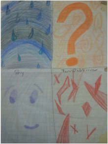
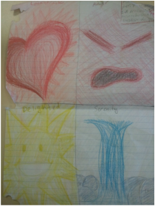
These are pictures of my prliminary designs, we did this to create ideas for our final project.
|
|
These here are my pictures of my overall designs, The first one is three question marks representing confusion, and the second one is a bunch of different swirls representing confusion.
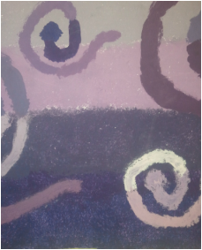
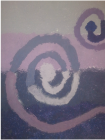
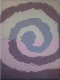
These pictures are of some close ups in the painting. The first one is of the background showing the different shades of violet. The second one is of all the swirls showing the confusion, and the third one is a really colse up of one of the swirls showing how the lines of the swirls change from light to dark depending on the background.
