Watercolor Reflection: January 27, 2012
1.) The good/strong parts of my paintings is the color and the detail of my designs, because they turned out just the way i imagined it.
2.) I think i could have done a better job with the creativity with my third design, because i was rushinig to get it done on time and it didnt turn out how i wanted it to.
3.) The atriributes of my paintings is the background they all contain really bold colors to make the painting stand out, i did this by using good brush techniques.
4.) For two of my paintings i used the natural colors of my design, for example i used green and yellow for my Masters design and Maroon and Gold for my Indiean hills logo. I used mainly primary colors for my designs. i used these because i wanted the paintings to stand out.
5.) I can conclude that water painting can be easy/difficult at the same time, becase some people enjoy it and some people dont.
6.) I learned from doing this project that when you watercolor it is easiest/smart to start with the background first. I also learned about hard work, because in the end if you put effort into the project it will turn out nice.
7.) I created the painting like i did because i wanted them to look like the originial design, this was not planned because i didnt come with these in my preliminary designs.
8.) I will use the skills and strategies i learned durring this project, like the blending and the background techniques, i will do this because i want my project to turn out the best as possible.
Intro Paragraph
For this project we did a watercolor painting, we were to paint postcards, representing the past, present, future. We had to use unity by repeating something in all three designs, I used alot of yellow, and primary colors in this design. I painted a picture of the Masters logo for my future, Indian Hills logo, for my past, and a Welcome to Clear Lake desing for my present. here are some pictures below.
|
|
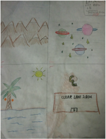
These are a picture of my preliminary designs, we had to draw these for ideas for our final project.
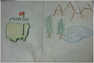
This is a picture of my overall post card designs when finished, It is in the order of Future, Present, and Past.
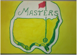
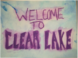
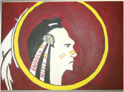
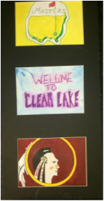
These three Pictures are of close ups of my three designs. The first one is the Masters log0, i used a bold yellow backgroung and green writing i wanted this to look exactly like the real logo. The second picture is supposed to be a Welcome to Clear Lake sign, i used a light blue with purple paing and kinda splatered it. The Third picture i painted is of the Indian Hills logo, i also wanted this to look like the original logo.
