Reflection questions
1.)
I think that the
good/strong parts of my portrait drawing was getting the outline and the scale
right, because mine looks pretty close to the original copy of the photo after I
got done drawing it.
2.)
I think I could
have done a better job with a few things like adding some more of the smaller
details to his face, hands, and belt. Because then it would have looked a little
better with those details added.
3.)
My light areas on
my portrait are the teeth, belt and his skin tone is lighter than most of his
clothing also there are some light spots on his pants because the sunlight is
reflecting off of them.
4.)
The darkest areas
on my portrait are the hat, shoes, and his pants. This is because these areas
are not reflecting sunlight in the photo and are supposed to be
dark.
5.)
The thing I
conclude about doing my portrait drawing is getting the grid/scale drew out,
because I think the grid helps you a ton by making sure you get all the detail
in the correct spot and the also helps with the overall size of the photo. I
also used 6B shading pencil that helped out with my blending to get a light/dark
look in some spots of my photo.
6.)
I learned by doing
this project that it is very difficult to get everything to match the original
photo, so It was a very tough thing to
overcome.
Preliminary Designs
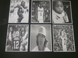
This is a picture of my preliminary designs for my portrait drawing. we printed of these pictures for ideas on what to draw for our overall project.
Overall Drawing
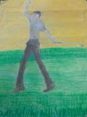
This is a picture of my overall design. i colored the background to look like a fall sky, and made the grass and green he was standing on, if i could change something i would go back and shade the whole portrait even the background because i dont like how the color looks. for this drawing i used oil pastels to color the backgroud and used a shading pencil for the body.
Close up 1
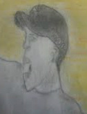
This picture is a close up of his face, i probably put the most work into the face just to try to get all of the detail.
Close up 2
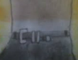
This picture is a close up of his mid section/belt, in this picture it shows the contrast between light and dark in the shirt from the pants, and also shows detail that takes in the belt.
